MOBILE RESPONSIVE DESIGN

ONE WEBSITE, EVERY SCREEN, WITHOUT COMPROMISING THE EXPERIENCE.

WHY NECESSARY?

WHY IS MOBILE RESPONSIVE DESIGN NECESSARY?

1. Reaches Mobile Audiences Your website adapts to smartphones and tablets where a large portion of online browsing takes place.
2. Keeps Navigation Intuitive Menus, buttons, content and layouts adjust to smaller screens for easier interaction.
3. Maintains Brand Quality Consistent typography, imagery, spacing and visual hierarchy preserve your professional appearance across devices.
4. Supports Better Engagement A comfortable mobile experience makes it easier for visitors to browse, inquire, book or purchase.

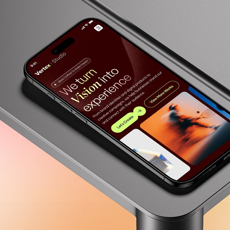
RESPONSIVE FOLIO

RESPONSIVE FOLIO

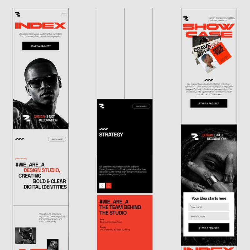
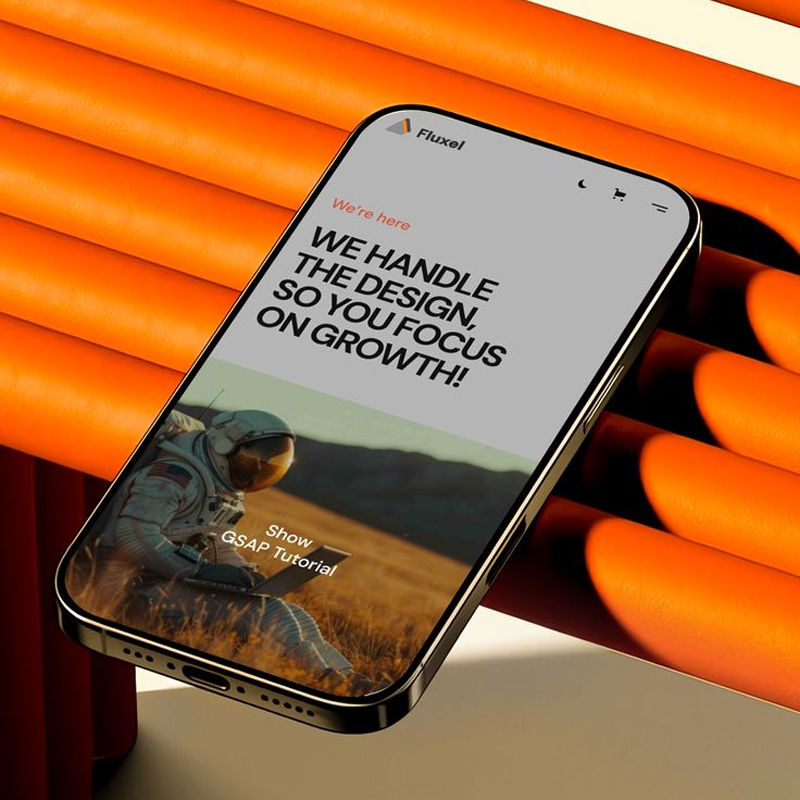
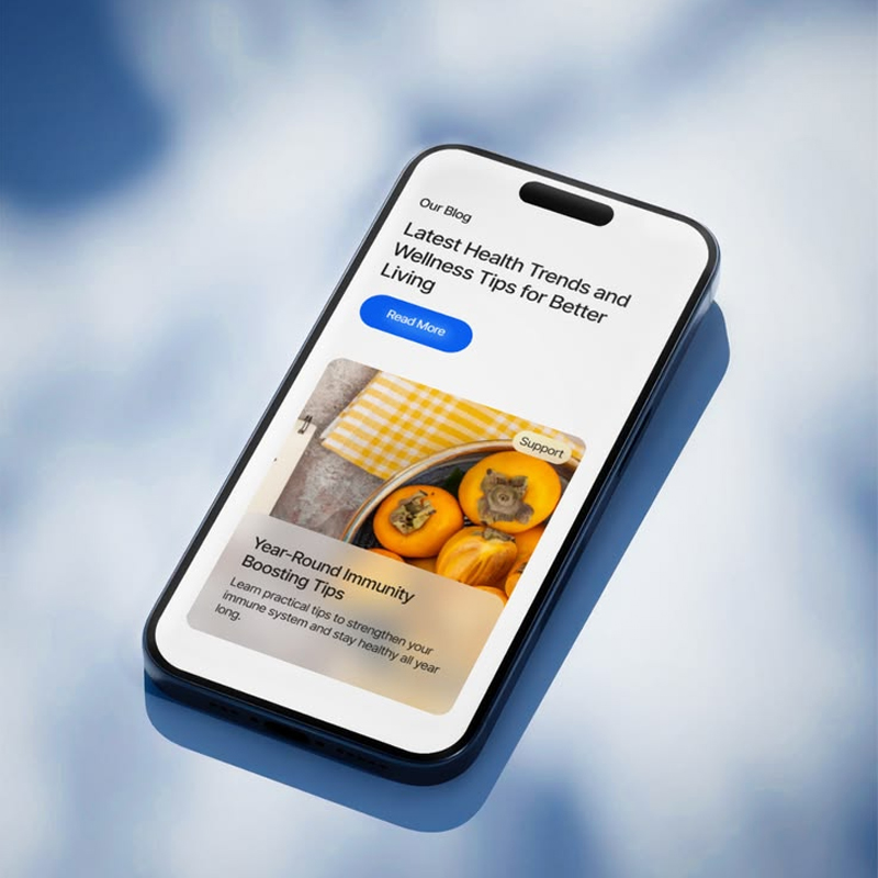
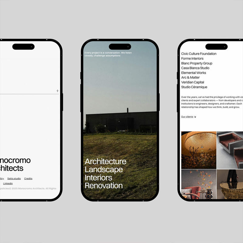
A website should remain functional and visually consistent regardless of the screen used to access it. Businesses with responsive websites benefit from easier mobile browsing, improved accessibility, stronger user engagement and fewer device related usability issues and your business can provide visitors with the same seamless access across phones, tablets, laptops and desktops.

OUR PROCESS

We review how every page behaves across different screen sizes and adjust layouts, typography, imagery, navigation, buttons and interactive elements accordingly. Each breakpoint is refined and tested to maintain usability and visual consistency from the smallest smartphone to larger desktop displays.

01

ADAPT

02

REFINE

03

TEST

CUSTOM PACKAGE

Make Your Custom Package

Build a package around exactly what your business needs and create a solution that fits your goals, scope, and budget.

Click Now ↗

TESTIMONIALS ▪

CLIENT FEEDBACK

FAQS

1. What is mobile responsive web design?
Mobile responsive design ensures that a website automatically adapts its layout, content, navigation, images and interactive elements to different screen sizes and devices.
Yes! Responsive websites are designed to adapt across smartphones, tablets, laptops, desktops and different screen resolutions.
Yes! An existing website can be reviewed and updated to improve mobile layouts, navigation, typography, spacing, images, buttons and other responsive elements where the current structure allows it.
PIXEL SKETCH STUDIO LIVE BUILD
CUSTOM STACK 00
BUILD MY CUSTOM PACKAGE
Pick only what your project actually needs.