
1. The Evolution of Digital Browsing and the Mobile Shift
In the contemporary digital era, mobile connectivity has fundamentally reshaped consumer behavior, enterprise workflows, and search engines alike. Modern users rely heavily on smartphones and portable tablets to manage virtually every aspect of their daily lives—from evaluating specialized professional B2B service offerings, researching technical product specifications, and analyzing verified client testimonials, to scheduling interactive software demonstrations, making direct financial transactions, and executing immediate digital purchases. As a direct outcome of this profound cultural shift, web design is no longer a static desktop discipline. Mobile-friendly website architecture and seamless multi-device compatibility have transformed from optional enhancements into essential requirements for any commercial enterprise seeking long-term success.
Historically, organizational websites were designed exclusively for wide, desktop display monitors with stable high-speed corporate network connections. Smartphone views were often treated as a secondary consideration or completely delegated to separate, stripped-down mobile URLs (such as separate ‘m.dot’ subdomains). However, modern consumer behaviors demand immediate, rich, and uncompromised digital interactions regardless of physical location or screen hardware. Whether a prospect is conducting preliminary market research during a morning commute, comparing vendor capabilities between corporate meetings, or finalizing procurement decisions from a remote office setup, your digital touchpoint is evaluated instantly.
When an enterprise web platform fails to render intelligently or properly on a hand-held mobile device, the commercial consequences are immediate and costly. A mobile visitor confronted with misaligned visual components, illegible miniature text block elements, truncated navigation trees, or broken interaction scripts will rarely spend time troubleshooting the technical defect. Instead, they will leave the website and choose a competitor whose digital ecosystem provides an effortless, responsive user experience. Ensuring robust mobile responsiveness across every touchpoint is therefore a important part of customer acquisition, enterprise brand positioning, and online revenue retention.
2. Defining Responsive Web Design: Technical & Functional Foundations
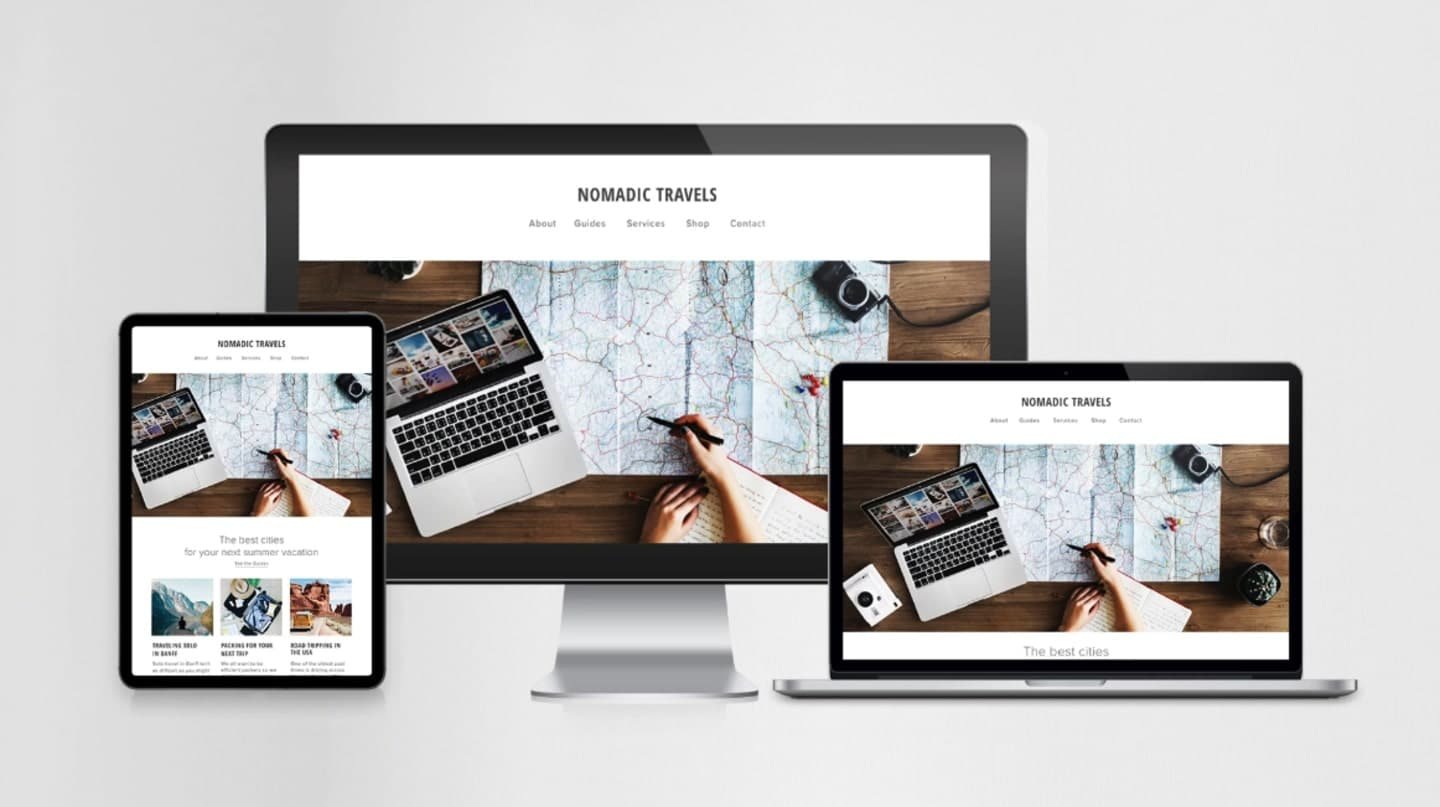
Responsive web design (RWD) is a development approach that enables a web application or site to dynamically adjust its visual structure, visual assets, navigation mechanisms, and interactive layout in response to the user’s specific viewport dimensions, screen hardware resolution, and device orientation. Rather than maintaining disparate codebases for desktop workstations, notebooks, tablet devices, and mobile phones, responsive website design establishes a unified, intelligent fluid grid framework driven by advanced CSS media queries, flexible vector imagery, flexible layout breakpoints, and modern layout algorithms.
When a visitor opens a responsive website engineered by Pixels Studio, the web document automatically adapts its layout to the visitor’s device and screen size. For example, on a large widescreen desktop display, a service page may feature a multi-column visual grid complete with persistent sidebar navigation, high-resolution media features, and expansive data visualization tables. When viewed on a smartphone screen, that identical document fluidly reorganizes: multi-column content blocks stack cleanly into an intuitive single-column vertical flow, full-width desktop navigation bars contract into an accessible off-canvas slide-out menu, and oversized graphic components automatically rescale without compromising page layout integrity or network loading speeds.
To realize a complete, high-performing mobile user experience, a modern responsive website must satisfy several rigorous technical standards:
- Dynamic Typography Scaling: Text content must resize fluidly using relative unit measures, guaranteeing flawless readability without requiring manual pinch-and-zoom interactions.
- Adaptive Fluid Layouts: Graphical elements, content containers, structural margins, and image containers adjust proportionally based on dynamic screen percentages.
- Touch-Optimized Interactive Elements: Navigation items, call-to-action buttons, and form input controls are explicitly sized and spaced to accommodate touch inputs seamlessly.
- Intelligent Touch Gestures & Menus: Deep, multi-level desktop menus are redesigned into simplified visual drawer overlays optimized for quick, intuitive thumbs-driven navigation.
- Streamlined Mobile Input Forms: Interactive forms adjust layouts, automatically select correct touch keyboards, and simplify data entry fields to accelerate user conversion.
- Optimized Media Asset Delivery: High-definition visual assets automatically scale and serve next-gen image compression formats based on device parameters to minimize network bandwidth usage.
3. Strategic Business Reasons for Adopting a Mobile-Friendly Website
1) 1) Reaching Customers Through Mobile Browsing
Global web analytical data consistently demonstrates that mobile devices generate well over half of all global web traffic. Consumers no longer restrict their internet research to formal office hours or desktop setups. Mobile browsing occurs continuously throughout the day—in transit, during retail visits, while watching media, and throughout business discussions. In a fast-paced market environment, a prospective business client or retail consumer frequently executes immediate digital searches to solve immediate operational needs. If your website is unoptimized for mobile browsing, you risk losing valuable leads at the exact moment of initial commercial interest.
2) 2) Improving Mobile User Experience
User experience (UX) represents the foundational pillar of modern digital engagement. When a user lands on a corporate site that requires endless horizontal scrolling, displays broken visual grids, or presents tiny, un-clickable hyperlinked text, their psychological friction increases immediately. This frustration damages brand credibility. Conversely, an expertly engineered responsive website design delivers immediate clarity and ease of use. By anticipating touch-screen interaction patterns, Pixels Studio crafts mobile interfaces that feel natural, refined, and completely effortless.
3) 3) Increasing Engagement and Reducing Bounce Rates
A high-performing mobile website design actively invites visitors to dive deeper into your corporate content. When navigation is clear and visual hierarchy is structured logically, users are naturally incentivized to explore additional service pages, read insightful technical blogs, inspect portfolio case studies, and review corporate certifications. On the other hand, non-responsive sites suffer from immediate bounce rates, as frustrated users abandon the site within seconds. A fluid responsive architecture removes these technical barriers, extending average session durations and cultivating meaningful user interaction.
4) 4) Supporting Conversions, Lead Generation, and Revenue
For commercial enterprises, a website is ultimately a strategic platform designed to drive business growth and customer acquisitions. Every structural design choice should guide visitors toward predefined strategic actions, including:
- Submitting formal RFPs or custom quote requests
- Completing embedded contact or consultation forms
- Initiating direct phone consultations through touch-enabled click-to-call buttons
- Scheduling interactive product demonstrations or service appointments
- Purchasing products or subscribing to software-as-a-service (SaaS) platforms
- Downloading authoritative whitepapers and strategic industry reports
If your primary lead conversion forms or checkout flows fail on mobile screens—due to oversized input boxes, unaligned drop-down elements, or non-functional submission triggers—your conversion funnel breaks down. Mobile website optimization directly removes conversion friction, providing streamlined pathways that turn casual web browsers into qualified leads and paying customers.
4. SEO and Technical Performance Benefits
The benefits of responsive web design extend far beyond aesthetic visual presentation and user interface design. Responsive architecture is fundamentally linked to technical Search Engine Optimization (SEO) and organic search engine discoverability. Leading search engines, spearheaded by Google, prioritize mobile usability as a foundational ranking signal.
Mobile-First Indexing
Under mobile-first indexing, search engine web crawlers evaluate and index the mobile version of a website as the primary baseline for search engine ranking algorithms. If a company maintains an excellent desktop site but presents an unoptimized, poorly structured, or content-deficient mobile view, its search engine visibility across all hardware platforms will suffer significantly. A fully unified, responsive website guarantees that search engine bots evaluate rich, complete, and perfectly structured HTML data regardless of device screen sizes.
Unified URLs and a Simpler SEO Structure
Historically, managing separate mobile websites required setting up duplicate subdomains (e.g., m.example.com) and configuring complex canonical and alternate tags to prevent duplicate content penalties. A single responsive website design consolidates all site domain authority, link equity, backlink profiles, and social sharing signals into a single canonical URL structure. This unified approach eliminates technical redirect overhead, simplifies site crawl budgets, and significantly strengthens overall search performance.
Page Speed and Core Web Vitals
Mobile website optimization requires strict technical performance engineering. Search engines evaluate user experience metrics known as Core Web Vitals, which measure Largest Contentful Paint (LCP), Interaction to Next Paint (INP), and Cumulative Layout Shift (CLS). A responsive framework built by Pixels Studio incorporates optimized asset delivery, lightweight CSS structures, efficient script execution, and modern image compression (such as WebP/AVIF formats) to ensure lightning-fast mobile loading speed and exceptional visual stability.
5. Brand Credibility, Visual Identity, and Customer Trust
Your corporate website is frequently the very first touchpoint a prospective buyer, commercial partner, or prospective employee encounters when researching your business. Consequently, your digital platform serves as a direct reflection of your company’s operational standards, technological competency, and brand values.
In the modern digital economy, visual impression equals institutional trust. A corporate platform that appears broken, visually distorted, or difficult to navigate on a modern mobile device communicates an unintended message: that the organization is technologically outdated, neglectful of user details, or lacking modern resources. Conversely, a slick, responsive design communicates immediate professionalism, authority, and customer-centric commitment.
Furthermore, brand identity demands rigorous visual consistency. Enterprises invest substantial strategic resources into refining corporate logos, typography scales, brand color palettes, visual iconography, and editorial tone of voice. A fully responsive architecture preserves brand integrity across every screen width. While structural grid layouts intelligently flex and reflow from three-column desktop views to single-column mobile views, the underlying corporate aesthetics—colors, fonts, imagery style, and messaging—remain entirely cohesive.
6. Accessibility and Long-Term Scalability
Improving Web Accessibility
Digital accessibility ensures that web content is usable for all individuals, including people with motor impairments, visual sensitivities, or cognitive processing differences. Responsive web design aligns directly with Web Content Accessibility Guidelines (WCAG) by supporting dynamic text resizing without breaking page layouts, establishing high-contrast touch targets, supporting screen-reader semantic structures, and ensuring seamless touch gesture navigation. Broadening website accessibility expands your reachable market audience while fulfilling critical corporate social responsibility mandates.
Preparing Your Website for Future Devices
The global hardware ecosystem is continuously evolving. Consumer electronics manufacturers regularly launch new form factors, including ultra-wide desktop monitors, compact laptops, varying tablet sizes, foldable mobile screens, wearable smart displays, and dual-screen devices. Attempting to build specialized code layouts for individual hardware configurations is fundamentally unscalable.
Responsive website architecture provides a future-proof foundation built on flexible, fluid standards rather than static pixel targets. By employing breakpoint logic tied to layout container boundaries rather than specific device models, a responsive platform designed by Pixels Studio gracefully adapts to both current screen sizes and emerging consumer devices without requiring complete structural overhauls.
7. Auditing Your Website: Is It Truly Mobile-Friendly?
Confirming true mobile friendliness requires moving beyond simple testing on a single personal smartphone. A comprehensive evaluation must analyze functional performance, rendering accuracy, navigation simplicity, and technical speed across diverse screen resolutions, operating systems, and web browsers.
If your team identifies shortcomings across any of these audit metrics, your current platform may be creating friction, driving away prospective clients, and hindering your commercial growth potential.
8. When Should You Consider a Responsive Website Redesign?
While minor front-end layout bugs can occasionally be patched with targeted CSS adjustments, legacy website architectures often contain underlying structural limitations that require comprehensive modern re-engineering. Organizations should evaluate a comprehensive responsive website redesign if they observe the following operational red flags:
- Persistent Mobile Drop-Off: Analytical tracking reveals disproportionately high bounce rates and low session times among mobile users compared to desktop visitors.
- Stagnant Mobile Conversions: Mobile traffic constitutes a substantial portion of total visitors, yet generates a negligible fraction of inquiries, leads, or sales.
- Outdated Visual Frameworks: The existing site layout relies on fixed pixel widths, legacy tables, or deprecated software frameworks that fail on modern mobile browsers.
- Sluggish Mobile Page Loads: Complex, unoptimized desktop assets cause slow loading speeds and high layout shift scores on mobile connections.
- Fragmented Brand Image: The mobile site presentation feels visually disconnected, stripped down, or inferior when compared to the desktop experience.
- Competitive Disadvantage: Direct industry competitors offer vastly superior, highly interactive mobile user experiences that capture market share.
9. Conclusion: Building a Stronger Mobile Experience with Pixels Studio
In the modern digital economy, a mobile-friendly website is no longer an optional luxury or a secondary technical feature—it is an indispensable operational baseline for modern commercial success. Today’s consumers, decision-makers, and business clients demand immediate, flawless, and intuitive access to corporate information across every device they use throughout the day. A rigid, outdated, desktop-only website creates unnecessary barriers, turning away valuable prospects and handing competitive advantages to market rivals.
Implementing a fully unified, responsive web design framework systematically removes these operational barriers. By delivering exceptional mobile user experience, accelerating page performance, strengthening search engine rankings, elevating brand credibility, and streamlining conversion funnels, responsive architecture empowers organizations to maximize their online presence and capture growing market demand.
At Pixels Studio, we specialize in conceptualizing, engineering, and deploying high-performance responsive websites tailored to the specific strategic goals of modern enterprises. Our engineering team combines cutting-edge front-end design, rigorous user experience optimization, robust technical SEO practices, and tailored performance tuning to build digital platforms that captivate audiences and deliver measurable business results. Your target audience is already browsing, evaluating, and interacting on mobile devices. Partner with Pixels Studio today to ensure your corporate platform is fully equipped to meet them with an uncompromised, responsive, professional, and user-friendly experience.